


25
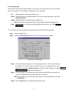
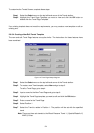
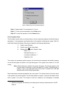
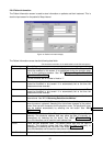
Figure 13: Blood Pressure Trend Setup dialog box
Step 8 Repeat steps 6-7 to set positions 2, 3, and 4.
Step 9 To save your trend template, click the Save button
Step 10 To cancel the operation, click the Cancel button .
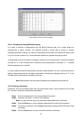
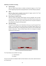
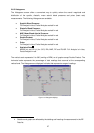
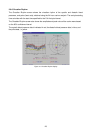
2-6-4 Correlation Plots
The Correlation screen offers a convenient way to view the relationship between the Blood Pressure
parameters. It also assesses overall performance of the patient’s cardiovascular system. Both Full
and Partial Analysis Correlation Plots may be viewed for the following relationships:
1) Systolic versus Diastolic
2) Systolic versus Pulse (Heart Rate)
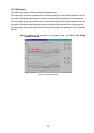
3) Statistical Data
3
: Systolic, Diastolic, Pulse
– Mean, " m "
– Standard Deviation, " s’ "
– Correlation Coefficient, " r "
– Regression Line
The vertical axis represents systolic pressure, the horizontal axis represents the diastolic pressure
on the left hand graph and pulse on the right hand graph. All the graphs have scales of 0 to 300
mmHg.
Note: If Partial Analysis is enabled, four graphs will appear. The first two graphs on the
left hand side of the screen, in blue, are based on Full data. The second pair of
graphs, in red, on the right hand side of the screen is created from valid data
specified within Partial Analysis parameters.
Each measurement recorded represents a dot on the screen. The vertical position of the dot is equal
to the systolic value on both graphs. The horizontal position on graph 1 is equal to the diastolic value
and on graph 2, the pulse. The clusters of dots are created by the overlapping of recorded
3 Statistics and graphs are effected by the deleting and inserting of measurements in the BP
Data list.